

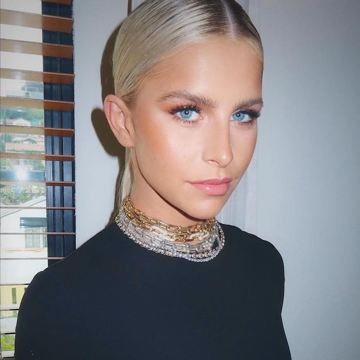
If you’ve scrolled through TikTok recently, I’m sure you’ve come across something called color analysis. I know I have. Ever since seeing my first color analysis post a couple of months ago, my timeline has been flooded with it. Here’s how it works (on TikTok at least). You pull up a filter, it pairs your face with four different color palettes, and depending on which one you decide flatters you the most, you’re assigned a season—either fall, winter, spring, or summer. The idea is that your season’s color palette will look the best on you, so you can apply it to everything from your clothing to your makeup routine.
As a beauty editor, I was most interested in the latter. I mean, how great would it be to go to the store, pick out a foundation or blush and know it would flatter you without even having to try it on? That would be game-changing.
While I was excited about color analysis as a concept, I had a feeling that it wasn’t as simple as it seems on TikTok, so I reached out to a color expert and style consultant, Julia Dobkine, founder of Agile Styling. She says that color analysis is done once in a lifetime and can have a profound effect on every aspect of your personal style. “Color analysis itself is a process,” she says. “[The resulting palette] can complement your natural coloring, bring out your best features, hide imperfections on your face, and makes you look younger and fresher.”
First and foremost, Dobkine says that professional color analysis is far more involved and nuanced than the filters you see on TikTok. That’s why she suggests avoiding them if you want an accurate result. “If you just want to have fun, go for it, but if you actually want an accurate result, don’t use the TikTok filters. I also don’t suggest using online applications. People are going to these online applications, they’re doing the analysis, and they’re getting completely wrong results. I did every application that’s out there, and I never got my palette—never. It was the other way around. My palette is super deep, and I would get one that’s not even close. Reach out to a professional.”
In professional settings, color analysis is basically a system of comparison and elimination. “When you compare certain palettes, you see which one looks better,” she says. “Then, by comparing and eliminating and following the right path, following the system, and knowing how to use it, you’re going to get to the perfect palette.”
While Dobkine says her color analysis appointments are different than other professionals, there are some similarities. For example, she uses large pieces of multi-colored cloth in the comparison and elimination phase to determine which palette flatters each client the most.
From there, she’ll discuss color psychology. Because, as she puts it, “We don’t see color, we feel color.” Since most people have strong opinions and biases towards color, it can be surprising to learn that their complimentary palette is full of colors they never considered before. “Sometimes we feel like, ‘this bright orange is something I’ve been dreaming about,'” Dobkine says. “You’re buying this, bringing it home, and wearing it once. It sits in your closet and you’re like, ‘Why did I buy this?’ When it comes down to it, she warns that “your palette will be colors that compliment you, and that look amazing on you, but you might not feel them right now.”
Finally, Dobkine will take her clients through their complimentary colors, explaining how they can use them to find the most flattering pieces of clothing, jewelry, and makeup products (even hair color). “Right now there’s a lot of emphasis on color analysis, but more emphasis should go on the result of color analysis. It’s like you’re going to get braces. The process of doing the braces takes, what, 20 minutes? But the result lasts a lifetime and you’re benefiting from it and enjoying it,” she says.
As for a universal, step-by-step method for doing color analysis, Dobkine says there isn’t one. “We’re all different and every face is super unique, which is why every face has its little points of analysis that I take throughout…there is no particular pattern that I can say, ‘If you check this, this, and that, you’ll be 100% covered.'”
As I mentioned before, TikTokers are saying, “I’m a winter,” or “I’m a summer.” I wanted to know more about what these seasons actually mean. “There are 16 seasons that I use,” Dobkine says. “Four of them are called home seasons—two cool seasons, and two warm seasons. Cool seasons are winter and summer. Warm seasons are autumn and spring. This is basically decided based on your undertone.”
Those four home seasons are then further divided into three other color dimensions. “First is temperature, another is value (how dark or light the color is), and another is intensity or chroma (how bright or muted). So, in each warm and cool season, there’s [a palette] which is bright and another which is muted. There’s another that’s light and another that’s more deep.”
Dobkine says it’s not unheard of for people to fall in between the designated home seasons. “In this case, we have additional seasons, and we call them flows. They flow in between seasons. So, each of the four seasons has three flows, and that’s what makes 16 palettes.” Clearly, it’s much more complex than TikTok let’s on…
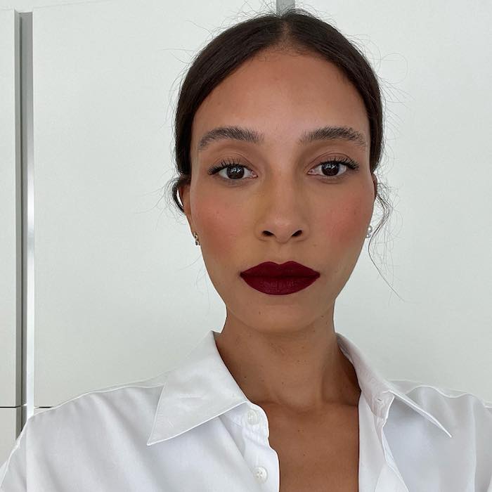
Color analysis is a science, but it’s not an exact science, which is why at-home color analysis is tricky. Still, there are some tenants of the process that you can incorporate. The first, and most fundamental, is knowing your undertone. “What drives every palette coloring and the best colors for makeup and hair is the undertone,” Dobkine says. “This is super important. If you have a cool undertone, you have to go with a cool foundation, cool-toned eyeshadows, and a cool-toned lip color. The same goes for warm undertones.”
So, how can you find out whether your undertone is warm or cool? You might refer to the old vein trick. The thought is, if your veins look blue or purple, you have a cool undertone. If they look more green, you have a warm undertone. Dobkine says this is a myth. “Veins are not showing undertone,” she says. “I don’t know who came up with this. It’s a myth. Undertone is a thin layer of tissue between your skin and your muscle. You may have absolutely warm, olive skin, and you can still have a cool undertone.”
So, how can you tell if your undertone is warm or cool? Dobkine says it’s simple. Just find a fuschia fabric and an orange fabric and compare the two colors against your face. “There are two colors that can be only warm and only cool,” she says. “Orange is always warm. Fuschia is always cool. If you match with the orange, you’re better off with warm makeup colors. If you match with the fuschia, you’re better off with the cooler makeup colors.”
From there, you’ll be able to tell if warmer or cooler colors complement you. That means you’ll know what shades of foundation, concealer, eyeshadow, blush, and lipstick are more likely to compliment you. Cool, right?
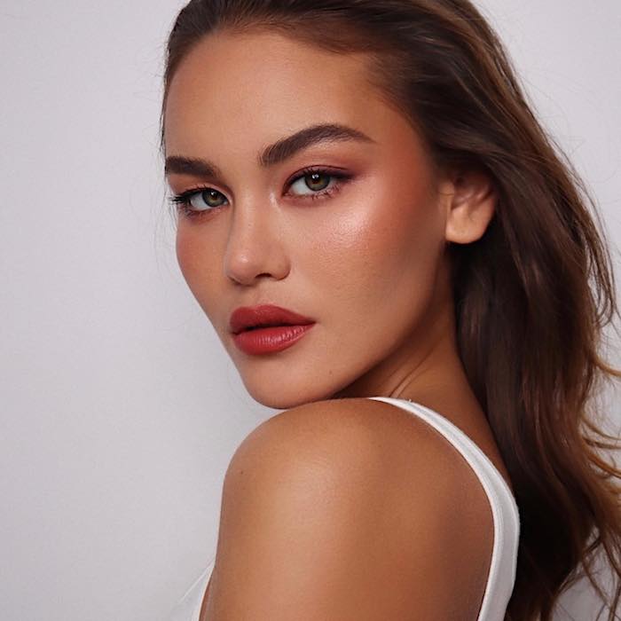
Makeup artists use color analysis (or at least a generalized form of it) every day when creating different looks for a diverse range of clients. Jamie Greenberg is a celebrity makeup artist and founder of Blighlighter and Bloss. “I try to look at the prominent characteristics on the face and use the colors according to that. For example, if someone has a light skin tone, I like to do a very light and delicate makeup look. I also make sure to note eye color in order to find the best eyeshadows to use to really make them pop.”
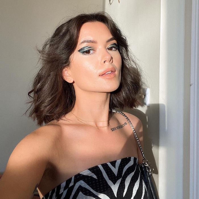
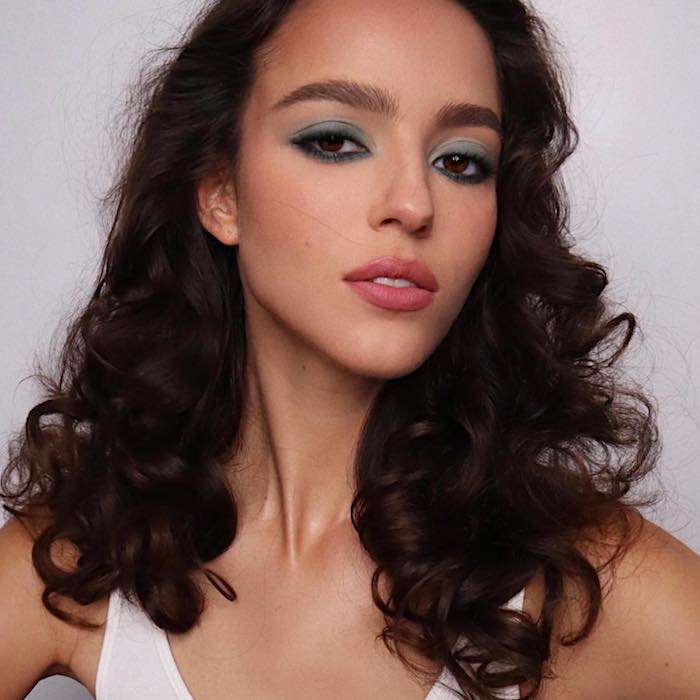
She recommends reaching for shades of pink and red if you have a deeper skin tone since these colors are sure to highlight your features. If you have a fair skin tone, she recommends reaching for shades of blue and green (specifically aqua blue).
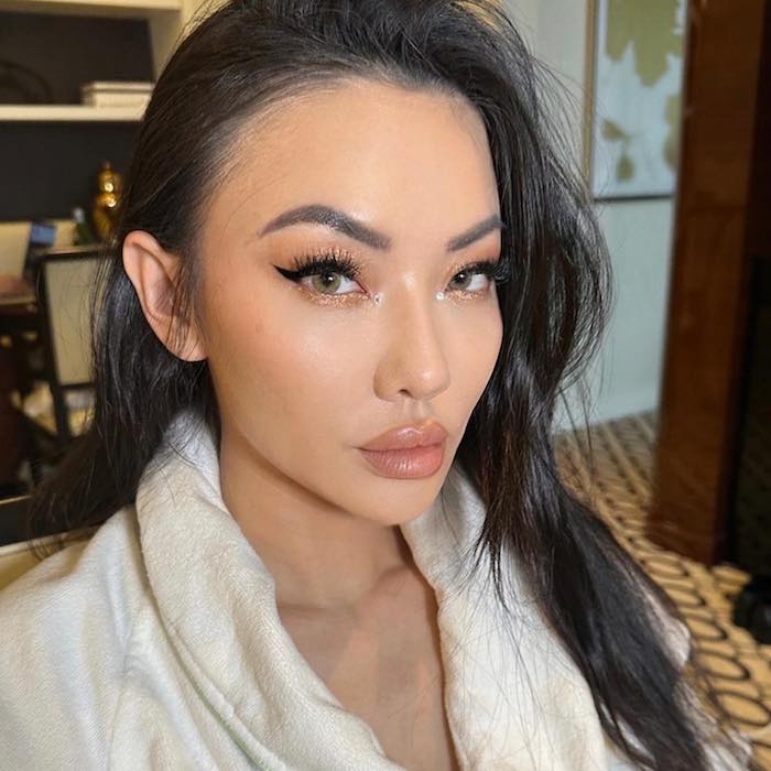
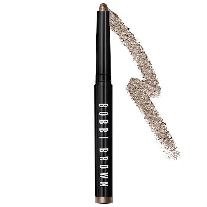
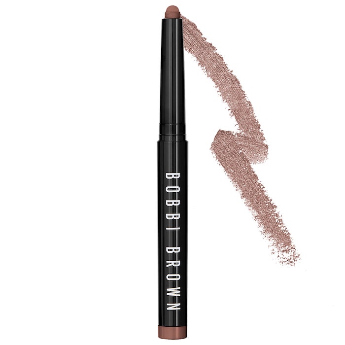
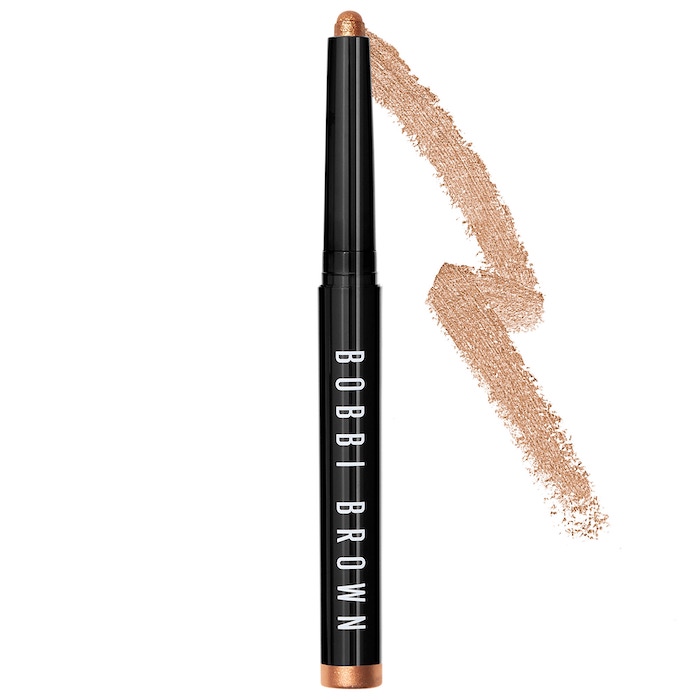
Victor Anaya, Director of Education & Artistry North America for Bobbi Brown Cosmetics, pays special attention to his clients’ undertone. “I’ll identify if someone is cool-toned or warm-toned and use complexion products in that same undertone to enhance the complexion,” he says. “I’ll also draw inspiration for the tones naturally found in the complexion/lip to help pick blush and lip color. For eyes, I lean into color theory to make determine eye makeup selection. If you want eyes to stand out, go opposite on the color wheel to enhance. If you want a more natural look, use colors close to your eye color.”
Next, Spicy “Sunburnt” Blush is Taking Over TikTok—14 Products You’ll Need to Try It.